Monday 28 November 2011

Ella's Directors Commentary

The definition of a commentary is a descriptive account of an event or a performance as it happens. A commentary may consist of a series of explanations and interpretations of a peice i.e in this case a music video. A commentary features personal opinions, interpretation, explication, feelings, evaluation, insight and reflection. Commentaries can provide information that would otherwise be disclosed to the audience members.
This is a link to a short directors commentary of the film Twilight. The style of the commentary is very simple, the directors voice is dubbed over a short scene in the film. He is giving he feelings and feedback on the scene and states the difficulties they went through while filming such as the character Bella having contacts in due to poor conditions and how Taylor who is covered in water and is so cold that steam is coming off of his body.
http://www.movieweb.com/dvd/DVtg6yuzqYaNwC/directors-commentary

Two types of commentary are scripted commentary and live commentary.
Scripted commentary
Pros:
  • You can provide the audience with clearer accounts of your veiws as you have already planned what your going to say.
  • You have all the time in the world to think about what you want to say, how you want to phrase it, and get as many chances as you like to record your narration. And if you don’t like it you can rewrite and try again.
Cons:
  • Writing and recording a script is very time consuming. You’re essentially going through the entire peice many times, watching each scene and giving full details of it.
  • It can be quite a daunting task to think of enough stuff to talk about for the entire time the peice is playing and you can’t have dead air in a script.
  • Unless you’re especially skilled, reading from a script sounds exactly like reading from a script. There’s really no way around this but hopefully the stuff you’re talking about is interesting enough that it won’t be a dealbreaker for anyone.
Live Commentary
Pros:
  • Nothing gets that “reacting to a subject in real time” rather than planning and structuring your feelings. Why edit out your mistakes when you can instead indulge in some good old-fashioned self-depreciating humor?
Cons:
  • Not only is editing out mistakes much more difficult, but so are retakes. If you say something too dumb for publication, or don’t have the volume set correctly you have to go back.
  • Watching a peice of work as well as thinking about what to say can prove difficult. 
Some ideas that I have for our commentary are..
  • Including a split screen. One side will feature the scene in our music that we are making comments on and the other the footage of us talking about it. This could make our peice more interesting.
  • Screen shots of things that we would be talking about such as how we created and edited different parts of our video i.e. screen shots of final cut.
  • Include images of our digipack and examples of how we created them.
  • Voice over, over specific parts of our video.
  • Include text to keep our peice interactive.

Digi pack

This is the inside cover for our album.

This is the front cover for our album.

This is our magazine advert.

Sunday 27 November 2011

Feedback On Final Music Video

Goodwins Theory:
Genre characteristics = fits genre well, nice and upbeat, colourful and dancing present.
Lyrics and Visuals = clear link between lyrics and the visuals of the song. For example 'call me up' with the telephone and also the picture of the childhood photo when the lyrics are 'never got enough attention as a child'
Music and Visuals = Pace of video fits the pace of the song.
Demands of record label = lots of shots of artist, works well to suit the pop genre.

Editing:
alot of jump cuts works well as it is an up beat song.
transitions on the phone at the beginning looks unique and good.
Green screen used - allows the focus to be on the people within the video, lots of different colours used with this fits the 80s pop theme.
Use of text works well again due to the vibrant colours.

Camera work:
Variety of shots from long shots to close ups.
Nice shots but bit blurred at times.
Frame positioning is good
Only downside is the shots are some time slightly blurred but not sure if its the quality of video on blogger.

Mise-en-scene:
Nice variety of props
Costumes fits song style and theme
Locations - not a wide variety but then this genre doesnt really need alot focus on dancing and colours.

Creativity and Performance:
Storyline bit vagure but the focus is put on the performance.
Creative idea present.
Lip syncing - bit out of sync out of times so this could have been improved.

Thursday 24 November 2011

Professional Magazine ad Analysis


The main image on this page is a single image of Florence and the Machine. This displays a need to sell the artist as she is the main focus among the other images. The institutional information is built up around the artist depicted the buzz of the magazine.

The single image represents the need to sell the artist as Lady Ga Ga is seen to be wearing one of her outrageous outfits which conventionally of her style, breaks the mould. The main headline which is spread across the page 'Lady Ga Ga unzipped' is a play on words and relates to the image. This ties the whole advert together. Other artists such as Katy B, Odd Future and Freindly Fires are featured at the bottom of the page. This gives the consumer an insight as who else is featured in the magazine. The byline 'I'm not full of sh*t are you?' represents the brash, out there attitude that artist has. The use of different colours in the font, picks out key words and phrases and works well for the overall look of the ad.

Digi-pack

In doing the plan of our digi-pack we have considered some things that we will have to include on both the front and back.

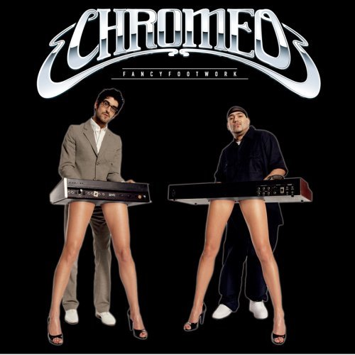
The facebook and twitter icons encourage our consumer to follow Chromeo on these sites which gives our artist more buzz. 'Need to sell the artist.'

The ratings should be accompanied by reviews of both the artist and the album. These will entice the consumer into buying the product.
Tracklisting is an obvious thing that we will incorparate on to the back of our digipack as it displays to the audience what tracks are available so that they are offered a choice.
We were interested in putting a competiton inside our digipack which we beileive would stimulate our consumers and give our artist more interest. As well as this, we have the idea of putting the different tour dates inside the digi-pack to keep our consumers updated as well as creating a fan base.

Chromeo Artist research


Chromeo is composed of P-Thugg (real name Patrick Gemayel, born in Lebanon) on keyboards, synthesizers, and talk box, and Dave 1 (real name David Macklovitch) on guitar and lead vocals. The two childhood friends jokingly describe themselves as "the only successful Arab/Jewish partnership since the dawn of human culture. The duo met in the mid-1990s, The debut album, She's in Control, released in 2004, defined Chromeo and started their music career. It was pretty much a failure at all levels. But we had “Needy Girl,” and “Needy Girl” was like a musical passport. That song went all around the world and DJs played it everywhere. he album took them on a two-year world tour performing in festivals such as Glastonbury, Reading and Leeds in the UK, Fujirock in Japan, Iceland Airwaves in Iceland, Pemberton Music Festival in Canada and Coachella, Bonnaroo, Rothbury Festival and Lollapalooza in the US.

Thursday 17 November 2011

Influences for our Digipack

Whilst beginning to produce our digipack, we were infuenced by 50s British and American pop art prints created by Andy Warhol. This is a famous print of Marilyn Monroe, in which we have used as inspiration for the front of our digipack. We really liked the funky and quirky style of the image and we thought that an image similar would reflect the funkiness of our music video. We thought of incorparating an image from our video which features a character holding a phone. This reflects the whole message of our song 'Call me up'. We used photoshop to create various contrasting colour techniques.

Wednesday 16 November 2011

Visual Theme Ideas for the Digipack

We want our digipack to entice features from our music video and include an image/s which are current and noticeable throughout the video. Many of the themes in which we want to use is the main convention of the 80's style which is present in the video along with the funky, bright and bold colors as well as writing. This will be the main feature of our digipack.

Some of the ideas which we have for the front of our digipack is to include an image from one of the shots in the video of the characters. This will keep the idea current and will enable our audience the oppurtunity to relate to the theme. One of the shots that we are thinking of putting on the front of our digipack is the image of all four characters at the beginning of the video. We would change the colour of the image and make it more bright, bold and enticing to the audience. The background arguably doesn't represent our theme in the best way, so therefore we would hopefully change this in photoshop to make the image more relateable with the music video.

Another image we are thinking of incorparating is the image of one character winking to the camera, holding a retro phone. This is a fun playful image and keeps with the main idea of a phone which features in both the song lyrics and the music video. We would change the color and make it more bold and bright, drawing our audience in.

Another theme that we could place on the front of our digipack is the character in a cow suit. This image could be called our motif as it features throughout the video and is something that is recognised by the veiwer. It's also a jokey image and is very playful. To make the image more appealing, we would change the colours and maybe the background.

On the front of our digipack, we will include the classic conventions of a digipack, the name of the artist, the name of the album and reveiws from MTV and other music organisations. We want the font to be bold, eyecatching and really funky in order to capture the audience's attention. We were thinking of having the name of the album slightly smaller then the name of the artist for the reason of 'need to sell the artist'. We think that having each letter a different color would be interesting. The reveiws from a range of music organisations will feature at the bottom of our front cover in noticably smaller font then the name of the artist and ablum. We are debating as to whether to have the font style funky and bold or to have it plain and simple. We will also include star ratings from music organisations, these will be big above the reviews. The star ratings will be good to have as they attract attention from the audience as to how good the album is.

On the back of digipack we will include our tracklisting for our album aswell as the record label company. The font for our tracklisting will be the same as our album name and artist name font to keep in with the theme.

Visual theme ideas for our magazine advert

Our ideas for the visual themes come from many of the concepts from our music video. For instance we have projected many strong images throughout the video which reflect an 80's theme. We reflect this theme through the use of bright colours and clothes and materials which relate to that era. Our continuous repetition usage of these images ensures the audience is definitely aware of the theme our music track portrays. Therefore we will continue to use this 80's theme with the use of bright colours in our magazine advert.

One of our ideas for our magazine advert is to capture an image from our music video which is repeated throughout the music video several times. One of the images we think could represent our theme well, is an image of all four of the characters featured within the video standing next to each other in the same stance/position. We thought this would be a good image to use as it portrays a clear representation of who will be featuring in our music video. In addition to this , the way the characters are all laid out on the scream creates a distinct image as we are all looking straight ahead at the camera, therefore it would feel to the audience as though we were looking at them ( grabbing their attention). Also our clothes we were wearing within the screen shot are still reflecting our 80's theme. We would aim to brighten up the image if we were to use that screen shot. This is because it would make a clear distinction from our original image and the one we will want to use in our magazine advert, the use of bright colour would also grab the reader's attention more.


Another one of our ideas for the magazine advert is to take a photo shoot of our characters featured within the group, still dressed in their 80's clothing, and to sit them on a giant speaker. This would create a bold image as it would portray to the reader of the magazine that our sound track is one which you will want to be listening to on a big speaker. In addition to this the big speaker would reflect the size of speakers that would have been used in the 80's. We would have our characters sitting on/ posing with the speaker to portray attitude and style which would make the image appealing to the reader. The background would be in the green room as this allows us to replace the background with an original image, which we could take ourselves or get off of Google. This would make our magazine image more original and interesting.


Our third idea for our magazine advert is to have the image of the girl holding the phone, relating the the lyrics in the song as if she's waiting for it to ring. The use of the phone is repeated throughout the video, therefore this image is recognisable to our video. This mirror image of the girl relates to the funky 80's style theme of our video. For our advert we would exaggerate this by using a bolder colour scheme, to make the image more lively attracting the audience more powerfully. We would have the name of the artist, album and release date etc on the bottom of the image in the gap shown, this would mean the attention is still on the image yet the main conventions of a magazine advert are still shown, and are clearly visible.


Final Music Video